Chapter 5 Results
5.1 Geofacet Plot
Time Series of Number of Homes Sold by State
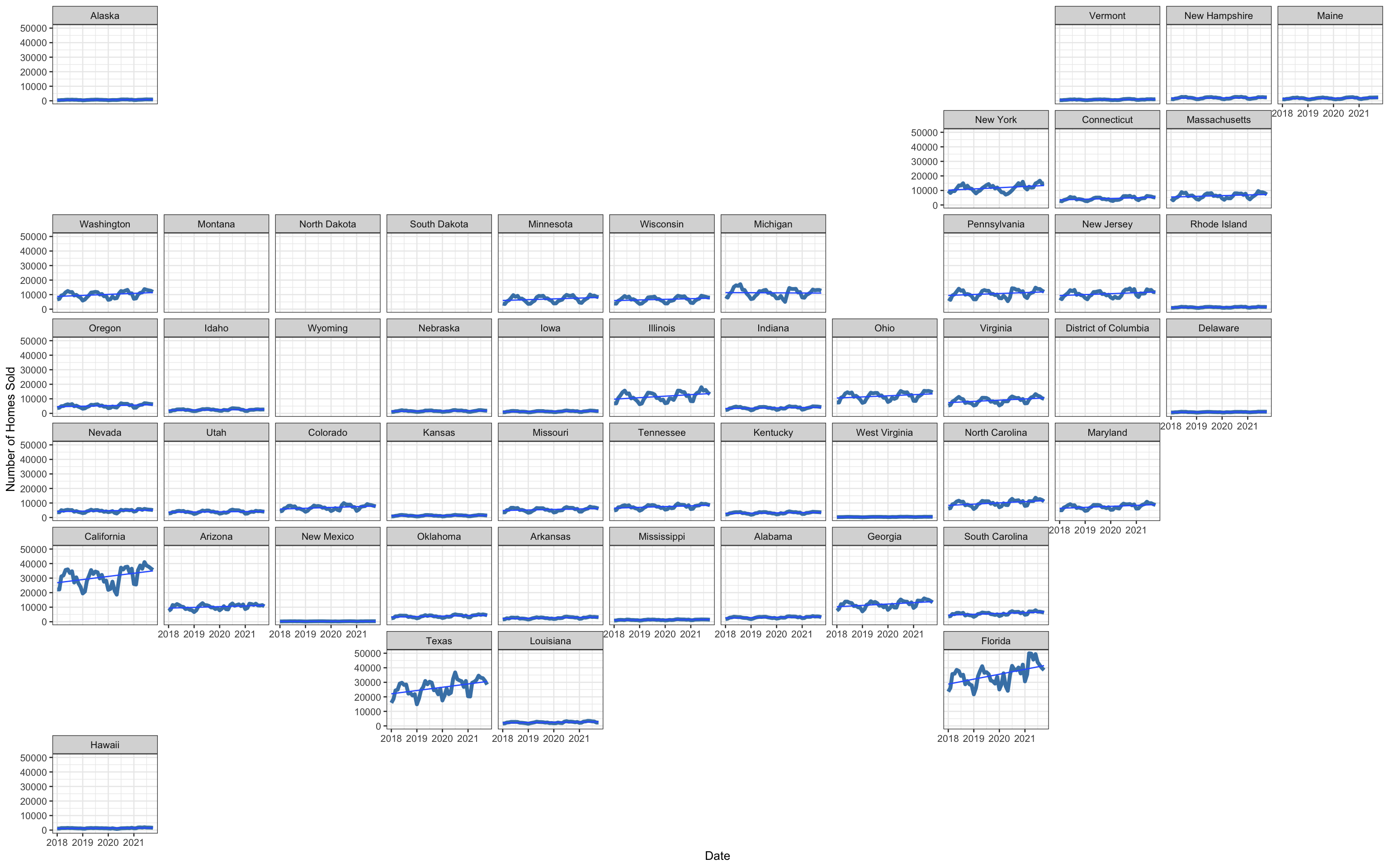
This Geofacet plot shows the number of homes sold over time by state. The time range is from January, 2018 to October, 2021. This graph is useful for identifying seasonal trends in number of homes sold, which could be a proxy for the demand for US housing. Additionally, we observed sharp changes in certain states during the pandemic, while the pandemic appeared to have a negligible effect on other states. For example, California, Texas and Florida surprisingly saw an increase in homes sold, while states like Nebraska or Delaware had relatively less change.
5.2 Bar Plot
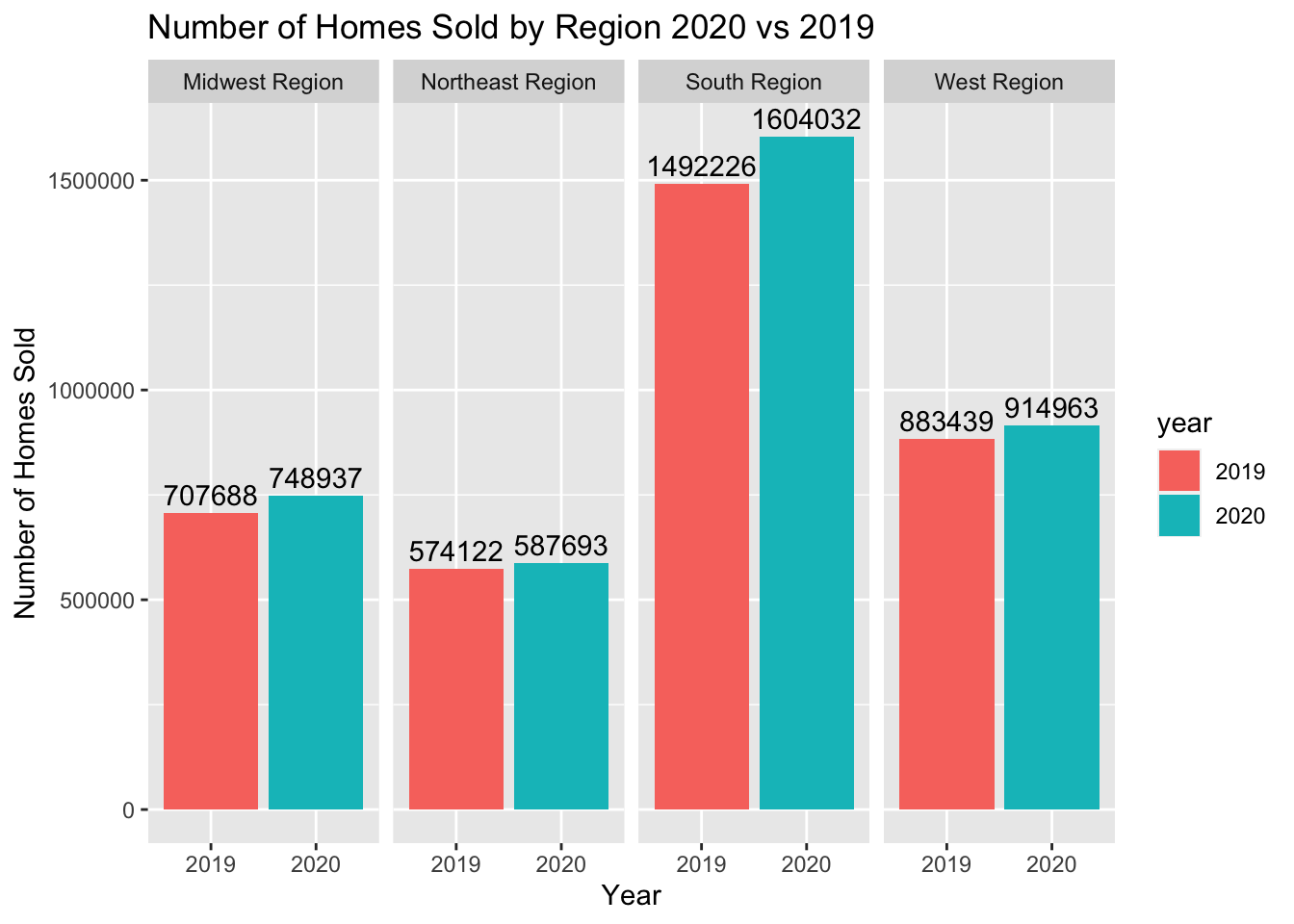
This bar graph shows that the number of homes sold increased in every region from 2019 to 2020. This is surprising when considering the increase in housing prices and the impact of the pandemic. The southern region has the highest number of homes sold and the highest increase, likely because more states in the dataset are considered “southern” compared to other regions. Additionally, because many Americans chose to move to those states in 2020.
5.3 Mosaic Plot
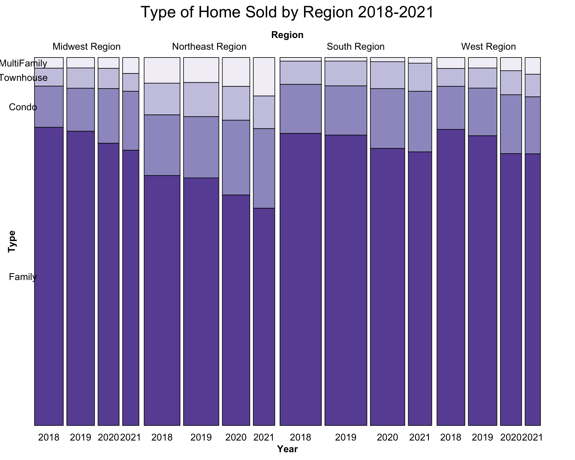
This mosaic plot shows the types of houses sold overtime (2018-2021) in different regions of the United States. The bars show the proportion of homes sold that correspond to each type (multi-family, townhouse, condo/co-op, single family residential). We noticed that over time, the number of single-family homes sold dropped in each region, while the number of condo and multi-family homes sold started to increase. We also noticed that this effect was comparatively more pronounced in the Midwest and the Northwest compared to the South and the West, although those regions still followed the general trend.
5.4 Overlapping Density Plots
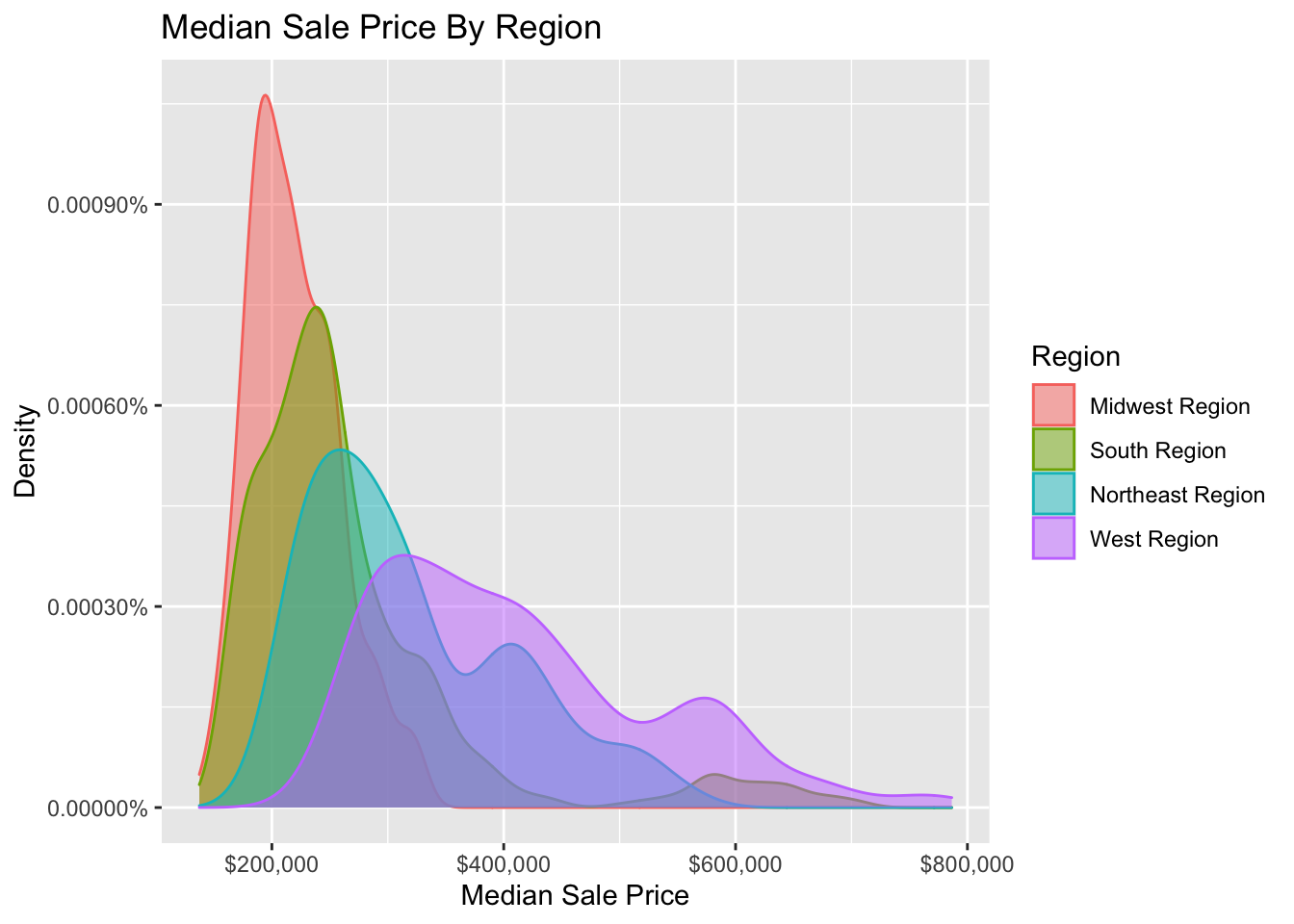
This overlapping density plot shows the distribution of median sale price by US region. We noticed that the Midwest region’s spread was lower than the other regions, and that it had the cheapest house prices on average centered around $200,000. The South region was also has high proportion of the data with cheaper house prices, and its distribution is slightly more spread out than the Midwest. The Northeast and the West are bimodal, and homes in those regions on average cost more. This is likely because more homes in these two regions are in urban areas compared to the Midwest and the South.
5.5 Cleveland Plot

This plot shows the percentage change in the number of new houses listed between 2019 and 2020 for each state, the data were sorted by the number of homes listed in 2019. The highlighted states are states with an annual absolute difference greater than 5%. The state with the biggest decrease was Hawaii, with an annual decrease of 11.6%. Washington, DC had the largest annual increase in homes listed (7.5%). One possible explanation for the states with strong decreases in the number of new houses listed is the pandemic. States like NY, PA and HI became much less appealing to move to during COVID-19, and thus less homes would be listed in these areas.
5.6 Time Series Plot (with mouse over information)
These are time series plots, with the upper plot showing months of supply and the lower plot depicting the percentage of listed homes that are off the market in two weeks. Different lines represent different states. This plot is also interactive, and when the reader mouses over a specific line, a popup is displayed showing the month and year of the given data point as well as its value and state.
Interestingly, based on the upper plot we noticed a dramatic drop in the months of supply starting at the beginning of the pandemic (2020) and continuing to the present. Additionally, as supply became restricted in 2021, we observed in the bottom plot that the proportion of homes sold in two weeks increased, meaning that homes started to sell quicker. Both of these changes were likely affected somehow by the pandemic, which made it harder to build and sell new homes and therefore reduced supply.
5.7 Map Plot
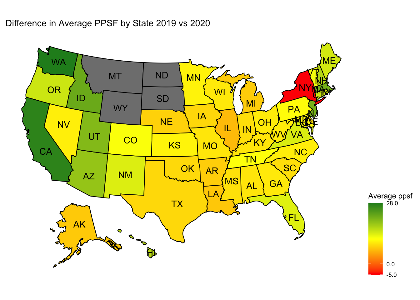
This graph is a heatmap of the difference in price per square foot between 2019 and 2020. Most states had a slight increase in average price per square foot sold, while states like California and Washington had noticeably large increases. Contrary to the general trend, in New York the average price per square foot decreased, meaning that relatively cheaper homes started to be sold. The states colored in gray are ones where no data was obtained. This trend of a general increase in housing prices is possibly caused by the high levels of inflation in the US economy during 2020, and the pandemic.
5.8 Box Plots
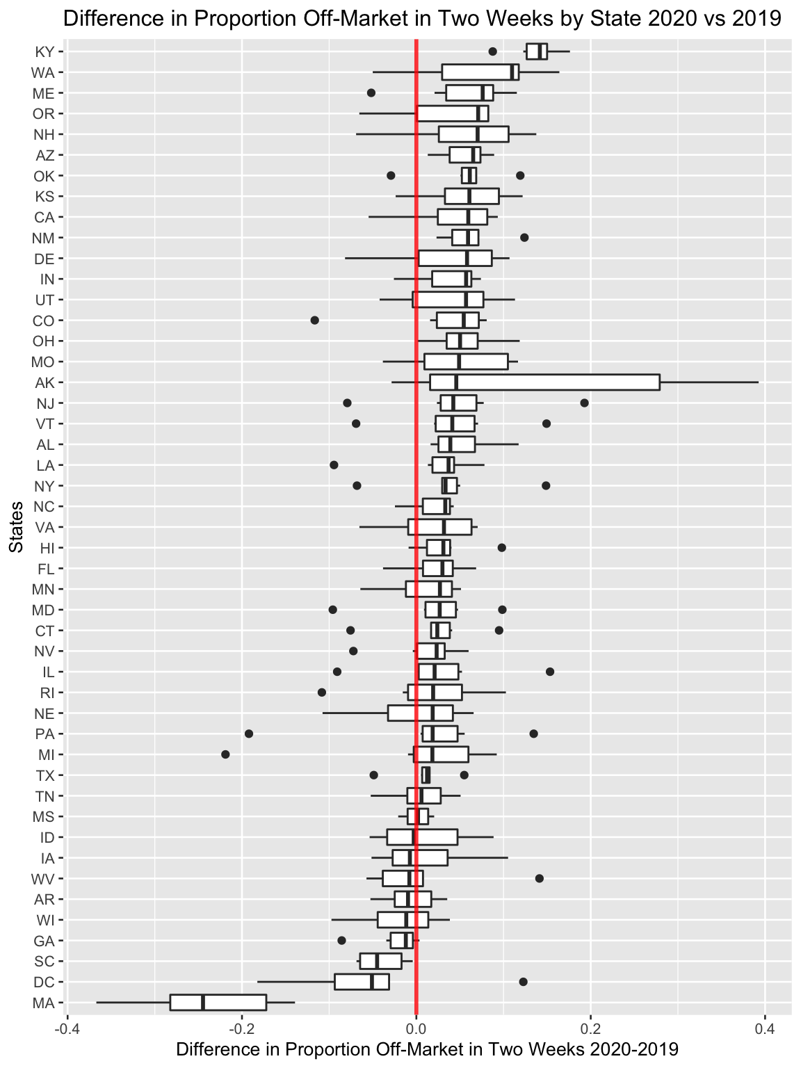
This boxplot shows the difference in the proportion of listed homes that are off the market in two weeks between 2019 and 2020. The red line represents a difference of 0, meaning no difference between years. This graph shows us that most states had an increase in the proportion, meaning that more homes in 2020 were sold within two weeks than in 2019.
Box plots are also useful because they give more information on the spread of the data, and can show outliers. Some states like Alaska have very big ranges, and one should factor this in when choosing to sell a home in a given state. On the other hand, Kentucky had the highest median difference in proportion (approximately 0.15), and a very small inter-quartile range. Massachusetts had a difference in proportion of -0.25, the smallest in the dataset.
5.9 Filled Density Plot
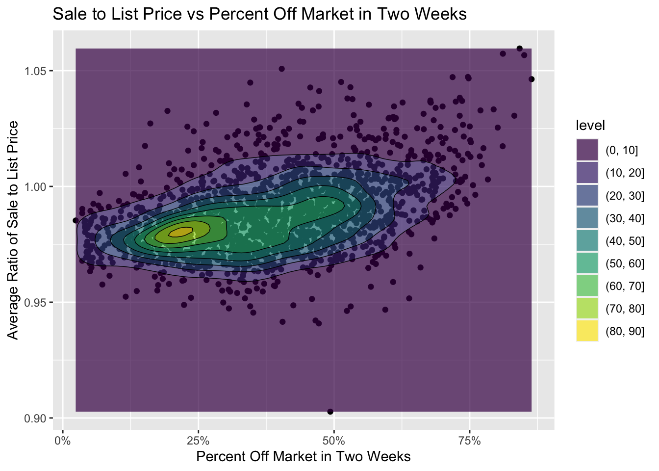
This filled density plot compares the average list price and the percentage of homes that are off the market within two weeks. The contour bands help the viewer to pinpoint where the majority of the data lie, and are useful for visualizing this very spread out distribution. From this graph, we observe that homes that have a ratio of 0.97 of sale price to list price on average tend to sell slower than homes with higher ratios of sale prices to list prices. This is likely because buyers who can bid above the asking price are able to convince the owner to sell very quickly and promptly close the deal.
5.10 Scatter Plots
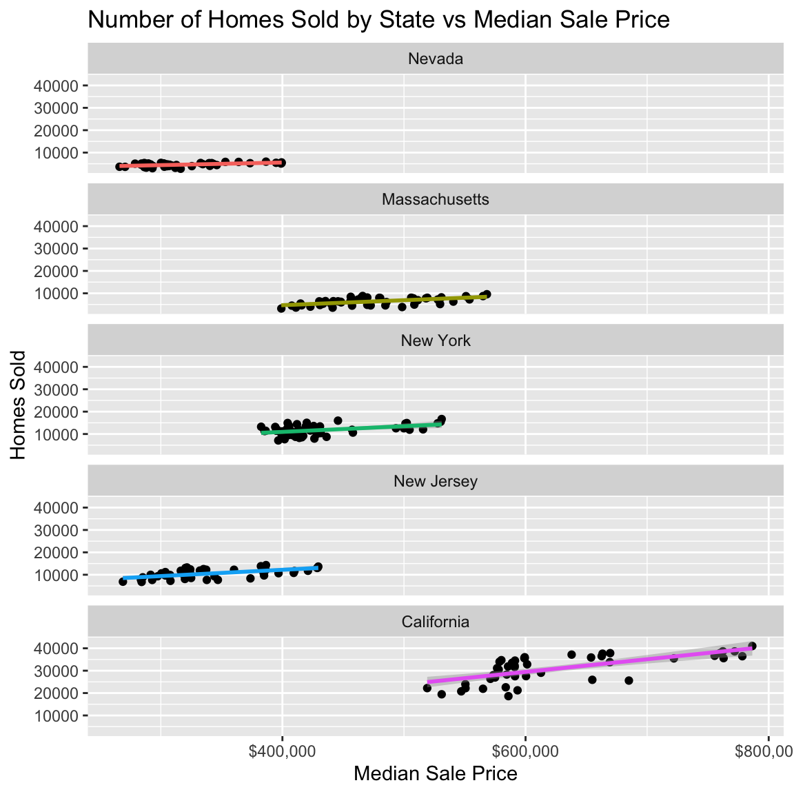
These scatter plots show the number of homes sold vs median sale price for the five states with the highest proportion of citizens living in urban areas. The states were sorted by slope of best fit line, from least to greatest. Interestingly, all of the states had a positive relationship between the number of homes sold and the median sale price, meaning that as homes become more expensive, the more homes are sold. California had the highest slope among those states, as well as the highest median sale price.